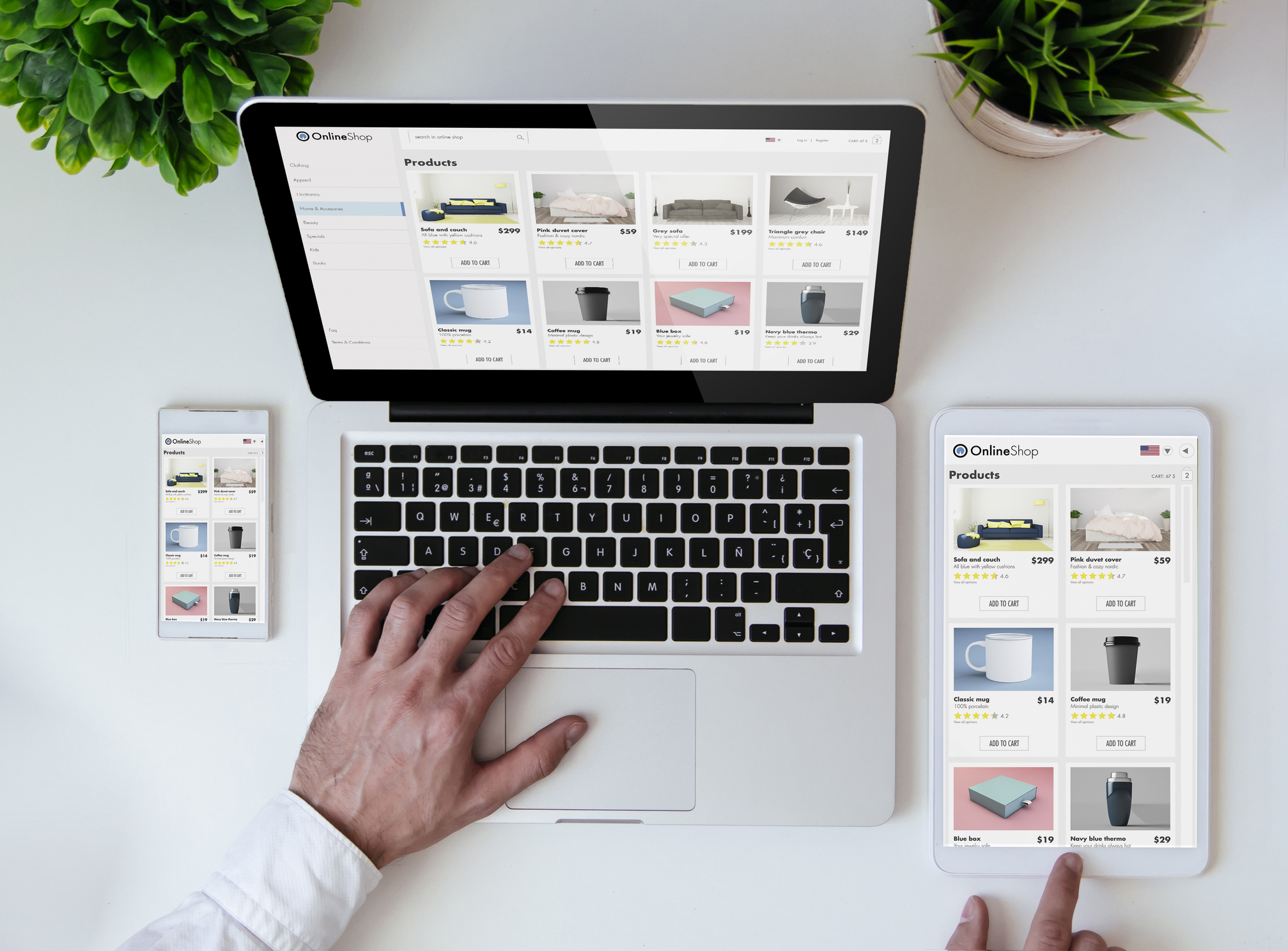
Increasing your eCommerce conversion rate requires optimizing your product page. You may have the most significant goods, the most effortless checkout procedure, the most successful Facebook advertising, and the most traffic. Still, they will remain empty without optimizing your product pages to impact and convert customers’ shopping carts.
To persuade consumers to purchase your goods, you must approach product page design intelligently. Everything must be deliberate, from the words you write and the pictures you use to the design you display and the purchasing experience you provide to site visitors. To assist you in optimizing your product pages and boosting conversion rates, below is a list of six proven techniques to use when creating your product pages.
Do Not Wait to Spark Attention
In journalism, every reporter is instructed to begin with the lead. This implies that a narrative should always start with essential facts and never let readers search for vital information.
Store owners may take a few cues from this strategy. While you may have a lot of critical product information on a single page, you should not leave prospective consumers hanging; all it takes is one back-button click to close a transaction. Make it immediately apparent what the product is and why it is functional.
Include a Pop-up Window
According to research by Sumo, the average conversion rate for all pop-ups is 3.09%. However, if done correctly, you may achieve the top 10% of pop-ups, which have an average conversion rate of 9.28%. This one modification will significantly increase your conversion rate.
Eliminate Excessive Form Fields
Have you ever intended to complete an online form only to be deterred by the overwhelming number of necessary fields? Eliminating all extra form fields, leaving just those required to complete your task, is one of the most effective methods of decreasing your conversion rate.
Utilize Eye-Catching Product Images
Good images assist your consumers in forming the first impression of your product, and they can either attract or repel customers. Frequently, consumers choose whether or not to continue searching based on your product photographs.
On your eCommerce product page, use well-lit, high-quality pictures. They must present your goods properly. Many eCommerce shop owners like photographing their products against a white or light-colored backdrop. This may assist you in maintaining consistency and highlighting your products.
Unlike in-store purchases, online consumers cannot see, touch, feel, or test your goods. That is why you should demonstrate your goods from a variety of perspectives. Before purchasing, 33.16 %of consumers like to see several product images.
Use Product Page SEO
In an era where businesses compete for top Google results, product page search engine optimization is critical for effective ranking. Titles and meta descriptions are critical components of this. How persuasively they are worded determines which Google result a visitor will click on. Because your product page includes transactional information, it is logical to utilize sales-oriented keywords. Additionally, you may include structured data in your product description pages.
 Establish a Sales Funnel
Frequently, asking for the sale too quickly kills conversions. Individuals may be “merely looking,” not mentally prepared, or not in a rush to purchase. The more expensive and complex the product, the longer individuals take before committing.
Providing a demonstration or a free trial instead of registration or purchase may substantially increase conversions for software items. However, in many instances, you must slow down and create a sales funnel to establish trust, cultivate relationships, and demonstrate competence.
Emphasize Videos
Why not bring your product to life with films that inform consumers why they need it? Additionally, product videos are a near-guaranteed conversion enhancer! Visitors who watch a product video are, on average, up to 85% more inclined to purchase it.
There are many ways in which product videos enhance the value of your website. Two of the most popular videos demonstrate the product in context and show how to utilize it.
For instance, Luxy Hair understands how significant hair color is to consumers. Consequently, they produced a movie for each color to assist visitors in visualizing the extensions once clipped in.
Conclusion
There are two types of marketers: those who realize that a website is a live system that needs constant testing and adjusting and others who believe they have created a website and are finished. It will help if you are a firm believer in testing and adjusting.
Beginning on-site optimization is not always straightforward; depending on your company, you may need to overcome technical and organizational obstacles before improving the site. Begin small and demonstrate the worth of your efforts at each stage. Optimization is a mentality as much as a technique – once you and your company begin to understand what works, it can spread like wildfire.
 About Complete Controller® – America’s Bookkeeping Experts Complete Controller is the Nation’s Leader in virtual bookkeeping, providing service to businesses and households alike. Utilizing Complete Controller’s technology, clients gain access to a cloud platform where their QuickBooks™️ file, critical financial documents, and back-office tools are hosted in an efficient SSO environment. Complete Controller’s team of certified US-based accounting professionals provide bookkeeping, record storage, performance reporting, and controller services including training, cash-flow management, budgeting and forecasting, process and controls advisement, and bill-pay. With flat-rate service plans, Complete Controller is the most cost-effective expert accounting solution for business, family-office, trusts, and households of any size or complexity.


